Creative Energy Work: Award-Winning Marketing Campaigns and Case Studies
Work
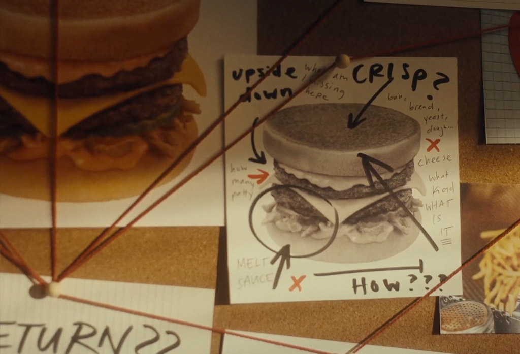
Patty Noir
The beloved but elusive Pal’s Patty melt, here today, gone tomorrow. We were inspired by the name Patty and that the sandwich goes missing for long stretches of time, so we imagined a noir world where our femme fatale Patty would return after a long hiatus. This spot highlights a new question the private investigator in each of us is yearning to know: the patty melt is back—but for how long?
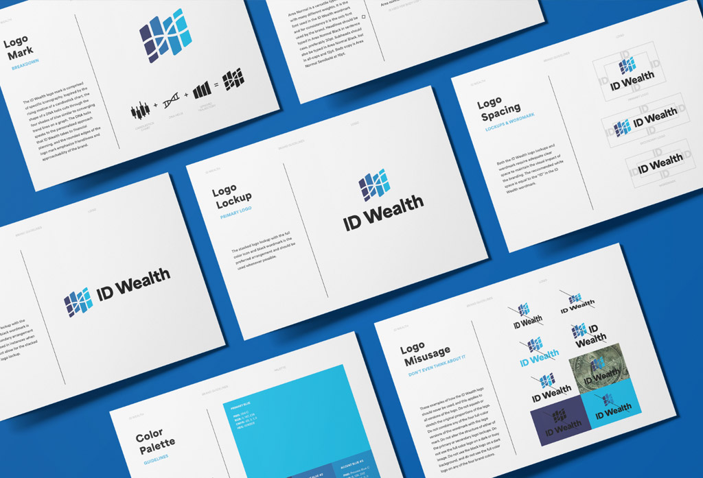
ID Wealth Brand Identity
ID Wealth, an up-and-coming wealth management group, tasked our creative team with designing their entire brand identity from scratch. The objective was to combine the company's mission, decoding the financial DNA of their customers, with the founders' goal to provide honest and professional financial advice. The final ID Wealth logo melds concepts including "candle sticks," an icon used in financial charts, the symbol of a DNA helix, and the path of an upward trajectory into an iconic brand identity.
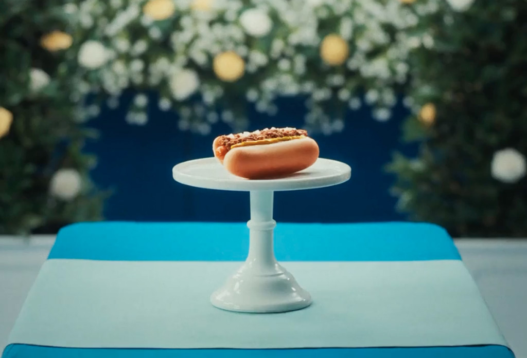
Best in Show
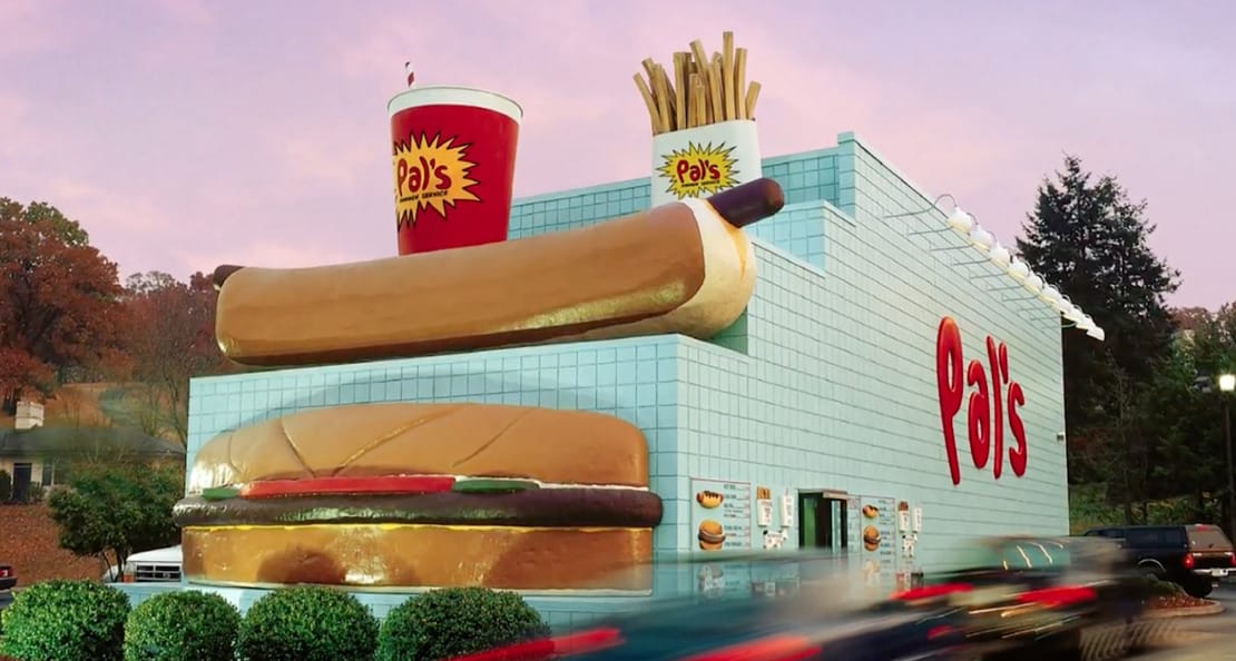
Everyone knows Pal's Hot Dogs are world famous, but we were tasked with pushing that fame even further. There was only way to do that - add man's best friend. Actually, add several. In the end, even when compared tail to tail with the bestest of boys, Pal's unsurprisingly ended up on top. We also learned the easiest way to create best in show work is to simply name it that.
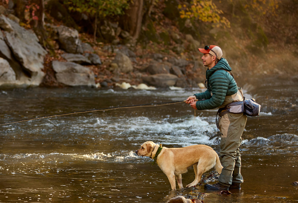
Abingdon Convention & Visitors Bureau
Abingdon Tourism
Nestled in the Blue Ridge Mountains, Abingdon, Virginia, is a hidden gem known for its scenic beauty, vibrant foodie scene, and rich history. Despite its charm, it’s often been overlooked by newer tourists, which is why the Abingdon Convention & Visitors Bureau asked us to create a promotional video and photography library showcasing what makes this town so special. We set out to capture the breathtaking fall landscapes, the fantastic foodie scene, and unique chill vibe that set Abingdon apart from other towns in the region. The toughest part? Showcasing everything this incredible town has to offer!
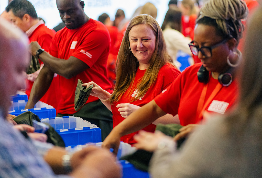
Coca-Cola Community
We partnered with Coca-Cola to create a video showcasing all of the good work they do with their community partners each year. Additionally, we captured photo and video content documenting various community engagement initiatives, such as assembling care packages for Veterans’ Day in collaboration with the USO, the Special Olympics + MLS Unified All-Star Experience and the National Tree Lighting with the National Park Foundation.
UNICOI COUNTY CHAMBER OF COMMERCE
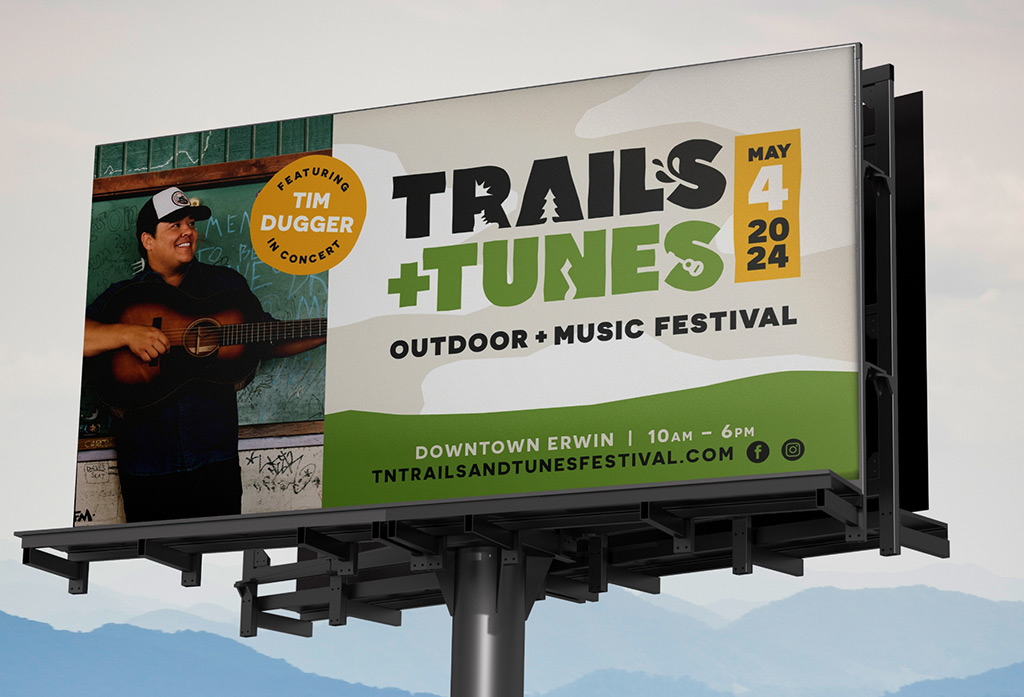
Trails & Tunes Festival
The first event of its kind, the Trails & Tunes Festival of Erwin, TN, needed to get the good word out of its existence. Targeting the Appalachian trail’s “bubble” (Where a large group congregates to hike the trail), as well as tourists from the neighboring areas, we were tasked to inform folks of a fun day of listening to music in the great outdoors. We created a logo befitting the event, a tagline that gets the people going, an inviting website, and targeted social media to promote this new and exciting festival. But when the festival you’re promoting is in the gorgeous East Tennessee mountains, the whole thing kinda sells itself.
Case Studies
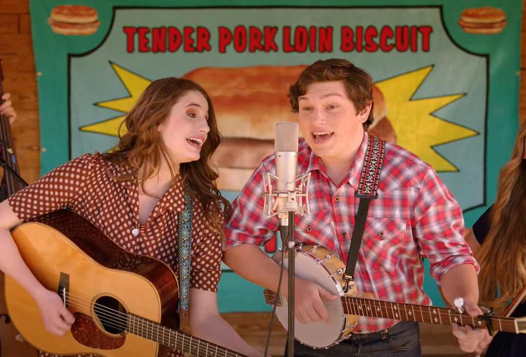
Bluegrass and Biscuits
Bluegrass and Biscuits
We pulled out all the stops to promote the return of the Tender Pork Loin Biscuit at Pal's. To promote this regional classic, we turned to the region's original music style: bluegrass. We put a new twist on a classic folk song called "Boil Them Cabbage Down" with talented young musicians from East Tennessee State University performing it. This song was incorporated into a TV commercial featuring bluegrass celebrity Tim White. We also used it to create social content, festival signage, SWAG, out-of-home ads, and a radio spot. So clap our hands, stomp your feet, and sing along to this catchy tune dedicated to Pal's Tender Pork Loin Biscuits.
Pals – The Climb to Fame
The Climb to Fame
How do you take a regional fast food restaurant and help them compete with industry giants? With strategic marketing and fresh, award-winning creative. Great client relationships result in big rewards, and our relationship with Pal’s is a reflection of how the right partnership can help a brand climb to cult status.
Pal’s Game
Sudden Service The Game
Previously a mobile app that was solely used as for nutritional information, we saw the opportunity to create a lasting branded engagement platform via a game, allowing for entertainment and seamlessly educating throughout, prompting a thumping 10,000 downloads within the first week, all done to further the brand mantra to bring surprise and delight to fans.