May 6, 2025
Choosing Fonts Based on Vibes Alone: A Scientific Study
by someone with zero chill and access to way too many fonts
Abstract
This article explores the highly scientific and not-at-all impulsive process of choosing fonts purely based on vibes. There will be no typographic theory, no concerns for readability, and no deck containing twenty-two options for the client to pick from—just pure, unfiltered energy and snap decision-making.
My hypothesis: I do not choose the font. The font chooses me.
My method: Scroll mindlessly until something feels right.
My control variable: Mistrust of anything called “Gotham” or “Helvetica Neue.”
Introduction
Typography is a precise, technical art form and a crucial part of visual communication. The right font can evoke emotion, establish tone, and spark joy—or rage—depending on the kerning. Traditionally, designers are taught to put great thought and care into selecting typefaces based on context, structure, and legibility.
This study rejects all of that.
Instead, for the sake of science, I am tossing aside all logic and learning from my formal education (deepest apologies to my graphic design professors at East Tennessee State University). I will embrace every intrusive thought I’ve ever had while scrolling through Adobe Fonts and dive deep into my archive of neglected typefaces as I engage in what I now refer to as vibe-based font selection. This intuitive, spiritually unhinged approach relies only on my impeccable taste and begins with one simple phrase: “I don’t know why, but this just feels right.”
Methodology
Participants of this study (aka: me, senior graphic designer at Creative Energy wearing old glasses that probably need a new prescription) have been asked to choose fonts for fictional design projects using—but not limited to—the following criteria:
- Gut feelings ranging from “meh” to “yes, queen”
- Whether the font has “main character energy”
- Personal emotional alignment with the font
- How much or little the font speaks to me
- A vague sense of “this one slaps”
There will be no research, zero creative department consultation, and a complete lack of concern for imaginary client expectations.
Experiment Results
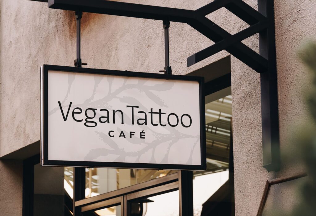
1. Logo for a Vegan Tattoo Cafe
Font Chosen: Quiverleaf CF
Vibe: “Barista with hand tattoos and a minor in art history”
Justification: High contrast sans serif that wants to be a serif so bad, but is okay with who they are and I respect that. Kind of funky, very unique, and smells faintly of patchouli and oat milk.
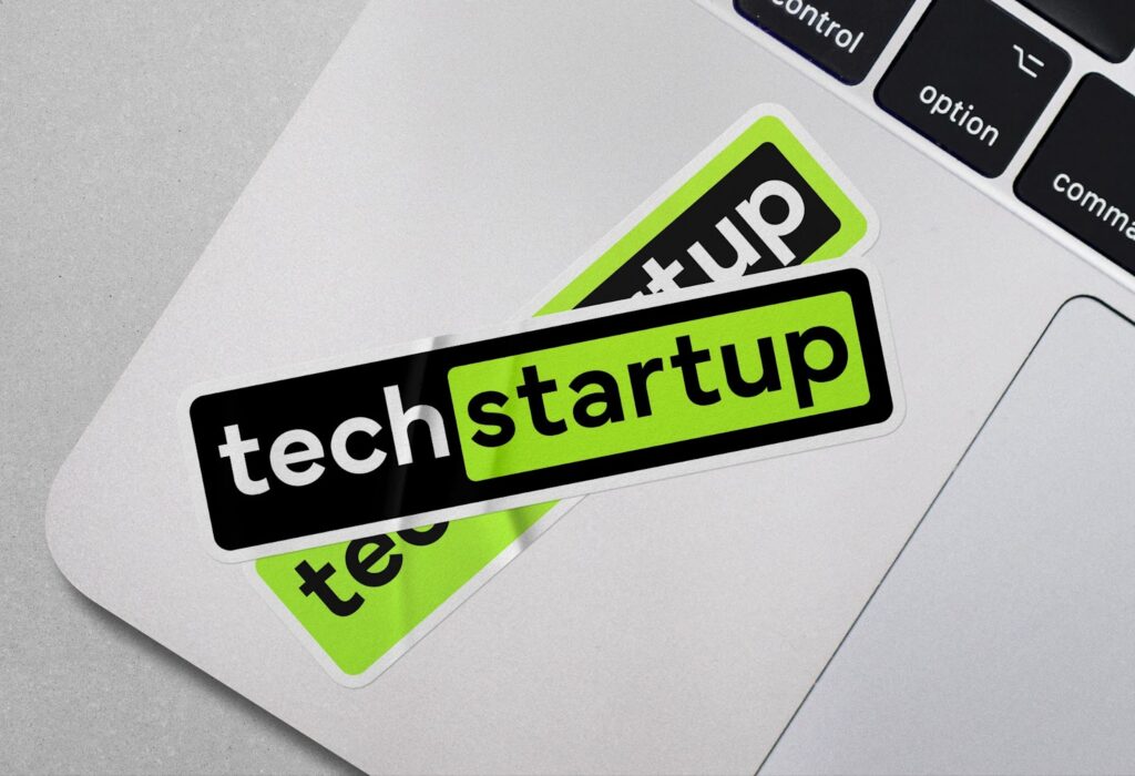
2. Tech Startup That Definitely Doesn’t Steal Your Data
Font Chosen: Mundial
Vibe: “Trust me, bro.”
Justification: A friendly geometric sans serif that just feels safe—suspiciously safe. Looks like it wears a North Face vest but has never actually been camping.
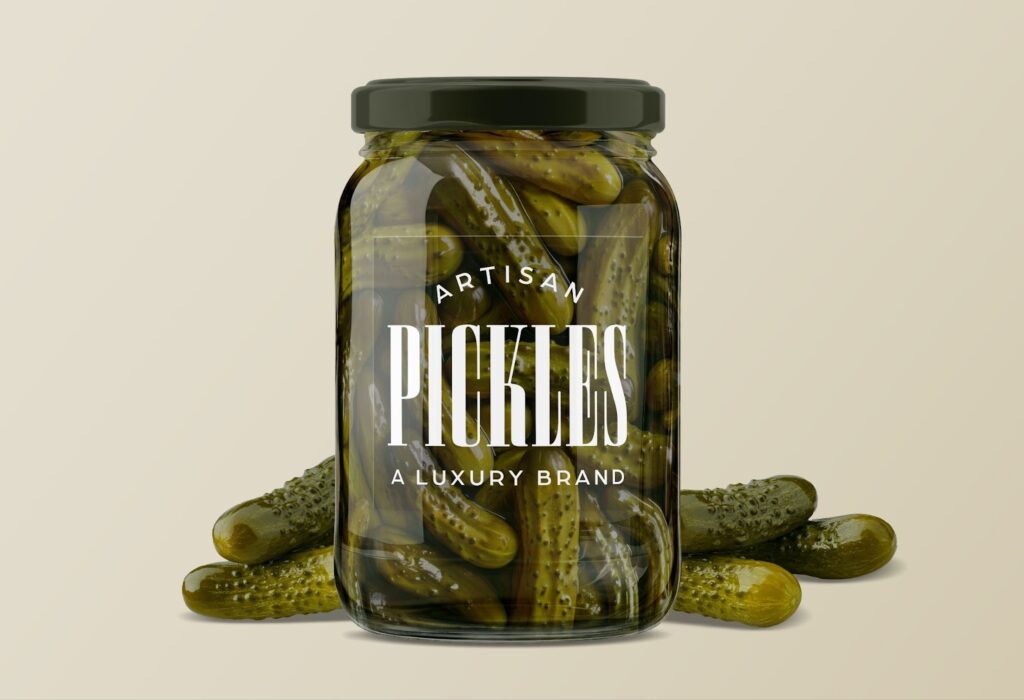
3. Luxury Brand for Artisan Pickles
Font Chosen: Smoosh
Vibe: “Rich aunt energy with a hint of vinegar.”
Justification: Aggressively high contrast serifs that scream, “I cost $17 a jar and live in Brooklyn.” I know it’s hard to read, but I just really wanted to use it, okay?
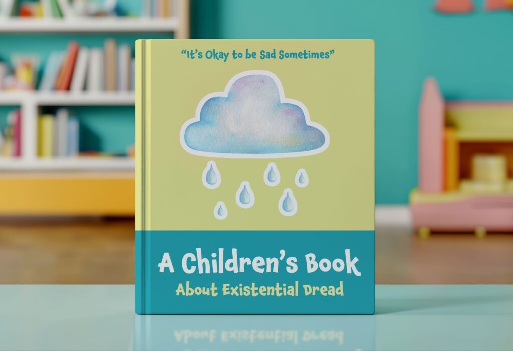
4. Children’s Book About Existential Dread
Font Chosen: Chaloops
Vibe: “The feeling of jumping into a puddle right after the sun comes out on a rainy day.”
Justification: Cute enough that I almost forgot how sad this prompt was. So comforting that it will distract from the book’s subject matter and won’t deter readers.
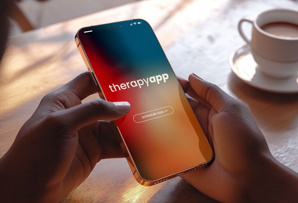
5. An App for Scheduling Therapy
Font: Poppins
Vibe: “Feels like being hugged by a calendar.”
Justification: Round, soothing, and whispers to me, “You can do this; scheduling appointments doesn’t have to be scary.” Has never once raised its voice.
What (If Anything) Did I Learn?
My results reveal that vibe-based font selection is faster (but also not faster?) and significantly more chaotic. I found that fonts possess strong, often irrational emotional identities that influence their selection, regardless of context. Quick decisions were imperative to avoid spending an entire afternoon scrolling through hundreds of fonts, just in case there was a better one on the next page. There usually wasn’t, but sometimes there was? Either way, rational criteria such as legibility or alignment with brand goals were often abandoned in favor of a font that just “felt nice.”
Other Observations:
- Increase in arguments with myself and my computer monitor
- Decrease in productivity
- 250% spike in downloading fonts that I’ll probably never use
- High levels of confidence in my irrational choices
- Moderate regret
Conclusion
This study confirms what I believe most designers already know but rarely admit: Fonts are vibes. Vibes are real. Logic is optional.
Except when it comes to legibility. That one’s actually important. Who knew?
My future research may explore related topics such as:
- Why I hate this font but use it anyway
- Why I love this font but never use it
- Fonts that inexplicably feel like red flags
- Do I actually have too many fonts?
- No I don’t
Until then, trust your gut, designers. And respect the vibes ✌️
Get insights delivered straight to your inbox.