Keep an eye on your inbox for insights and more from Creative Energy!
Insights
How Restaurants Are Digging Out Of The Traffic & Sales Doldrums
There are very few winds in the sails of restaurant chain sales this year. Let’s face it, the business is flat with maybe 1% overall growth thanks to the travel and recreation segments.
See Full ArticleIs Your Website Costing You Customers?
An outdated website doesn’t just miss opportunities — it actively costs you customers. If you’ve ever felt the sting of hesitation before sharing your website, or worried visitors might leave unimpressed, it’s time to face a tough truth: your website may be working against you, and you might not even know it.
See Full ArticleOur Latest Work
Abingdon Convention & Visitors Bureau
Abingdon Tourism
Nestled in the Blue Ridge Mountains, Abingdon, Virginia, is a hidden gem known for its scenic beauty, vibrant foodie scene, and rich history. Despite its charm, it’s often been overlooked by newer tourists, which is why the Abingdon Convention & Visitors Bureau asked us to create a promotional video and photography library showcasing what makes this town so special. We set out to capture the breathtaking fall landscapes, the fantastic foodie scene, and unique chill vibe that set Abingdon apart from other towns in the region. The toughest part? Showcasing everything this incredible town has to offer!
Coca-Cola Community
We partnered with Coca-Cola to create a video showcasing all of the good work they do with their community partners each year. Additionally, we captured photo and video content documenting various community engagement initiatives, such as assembling care packages for Veterans’ Day in collaboration with the USO, the Special Olympics + MLS Unified All-Star Experience and the National Tree Lighting with the National Park Foundation.
UNICOI COUNTY CHAMBER OF COMMERCE
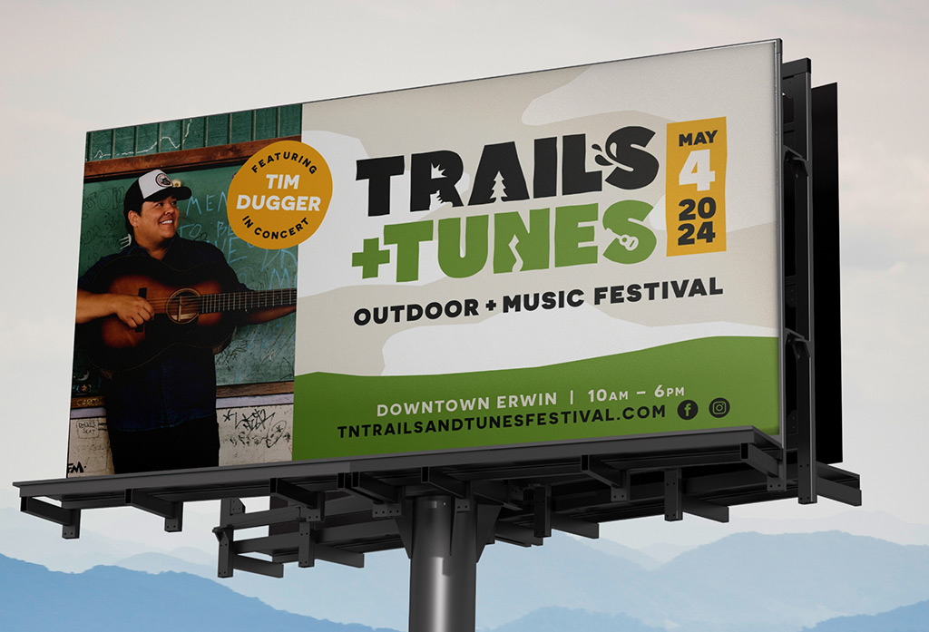
Trails & Tunes Festival
The first event of its kind, the Trails & Tunes Festival of Erwin, TN, needed to get the good word out of its existence. Targeting the Appalachian trail’s “bubble” (Where a large group congregates to hike the trail), as well as tourists from the neighboring areas, we were tasked to inform folks of a fun day of listening to music in the great outdoors. We created a logo befitting the event, a tagline that gets the people going, an inviting website, and targeted social media to promote this new and exciting festival. But when the festival you’re promoting is in the gorgeous East Tennessee mountains, the whole thing kinda sells itself.
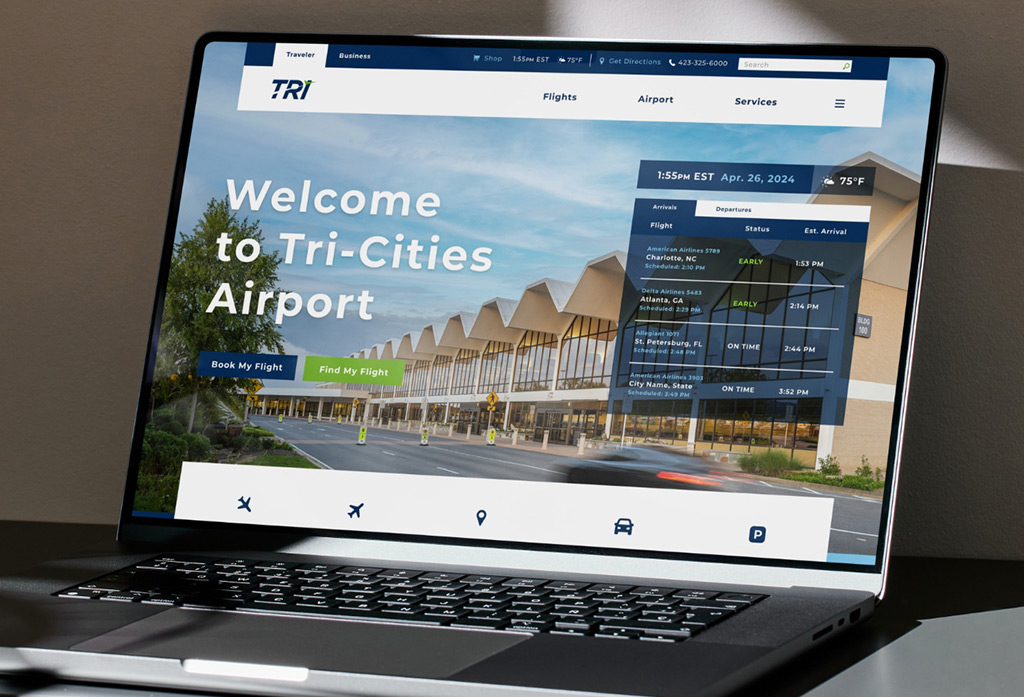
Tri-Cities Airport Website
We love our local airport—no seriously, we love it. Tri-Cities Airport connects us to major hubs with endless destinations, and we don’t even need a cartography degree to find our gate. Flying local is easily the most convenient way to begin any journey, and Tri-Cities Airport needed their website to display their wide array of customer services while also reflecting their goal of attracting new business opportunities and bringing more route options to our area. FlyTRI.com accomplishes all this and more with a completely reworked site structure, redefined user journeys, and a sleek new design.


