Sign up for Creative Energy’s newsletter to keep up to date on all of our latest news, projects, and insights!
Insights

My Lucky 250th
Lucky to have been born in America. Lucky to have grown up believing that hard work mattered. Lucky to have crossed paths with people who saw something in me before I fully saw it in myself.
See Full Article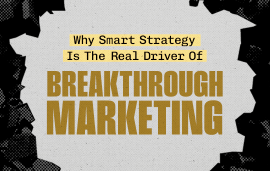
Why Smart Strategy Is The Real Driver Of Breakthrough Marketing
As restaurant chains head into the new year, one thing is clear: traffic growth is harder to earn, discounting is riskier, and customers are more intentional about when and where they dine. In this environment, seasonal limited-time offers (LTOs) are no longer “menu novelties.” They are one of the most reliable levers brands have to create urgency, relevance, and repeat visits.
See Full ArticleOur Latest Work

Dad Tricks
Pal’s is proud to serve up burgers reminiscent of a backyard cookout. With their fresh ingredients, two perfectly sized patties, creamy mayo, and delicious cheese slice, we think Pal’s does better than Dad on the grill. So the next time your homemade burgers are better than ever, check to see if there’s an empty Pal’s bag lying around.
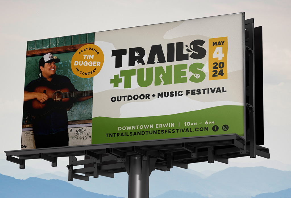
UNICOI COUNTY CHAMBER OF COMMERCE
Trails & Tunes Festival
The first event of its kind, the Trails & Tunes Festival of Erwin, TN, needed to get the good word out of its existence. Targeting the Appalachian trail’s “bubble” (Where a large group congregates to hike the trail), as well as tourists from the neighboring areas, we were tasked to inform folks of a fun day of listening to music in the great outdoors. We created a logo befitting the event, a tagline that gets the people going, an inviting website, and targeted social media to promote this new and exciting festival. But when the festival you’re promoting is in the gorgeous East Tennessee mountains, the whole thing kinda sells itself.
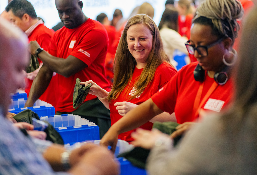
Coca-Cola Community
We partnered with Coca-Cola to create a video showcasing all of the good work they do with their community partners each year. Additionally, we captured photo and video content documenting various community engagement initiatives, such as assembling care packages for Veterans’ Day in collaboration with the USO, the Special Olympics + MLS Unified All-Star Experience and the National Tree Lighting with the National Park Foundation.
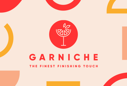
Garniche
A brand that’s a cut above all the others. Garniche is a collection of top-shelf dehydrated cocktail garnishes with a unique, tasty twist to their products. We were asked to bring this garnish brand to life through a comprehensive, cutting-edge brand design including a logo, brand guidelines, sample box design, and decadent copy as the finest finishing touch to this niche new brand.