June 5, 2024
The Good, The Bad, And Who Can Tell The Difference: Studying The Perception Of Graphic Design
Jacy Embray

Do people outside of the graphic design world actually see good design? When I took my first design class in college, I learned all about the principles of design, color theory, kerning, typography, hierarchy of information, white space, etc., and with my new knowledge and enthusiastic spirit, I set out into the wild to exercise my creative snobbery and point out all of the wrongdoings in the graphic design world. When I did this, I would usually get this response from the non-designers around me:
“Wow, I never noticed that.”
This led me to wonder if non-designers—regular people—didn’t see bad kerning or cluttered layouts or comic sans and if they did see those things, it just didn’t matter to them. A worse possibility popped into my head—what if they preferred it that way? Spiraling further, I wondered if what I was doing mattered at all.
*cue violin music and sad graphic designer walking down a dark and rainy road*
Don’t fret too long, I have good news. After working in the industry for over six years, I’ve learned time and time again that the fundamentals of good design matter so much, and not just to the people who put them into practice, but to everyone.
But don’t just take my word for it. I ran a little survey among a group of non-designers and asked them to pick the image they preferred, one being a “good design” and one being a “bad design,” both determined by me, an experienced, educated graphic designer who would love to tell you exactly why there is a clear winner between the two.
Here are some examples from my survey with my findings included:
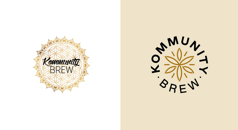
I picked this rebrand because it’s a great example of a generic logo turned professional. The old logo is overly detailed and complex while the new one retains their symbolic icon while staying simple and brand-focused. When shown these two designs, 87.5% of non-designers picked the one on the right.

Here are two more logos. Both are heating and cooling companies, both use blue and orange colors, and both use a sans serif font. However one is hands down better, and it’s not just because it’s simpler. The logo on the left is also clever. When you look at this logo, you may see the “N” first and then see the arrows denoting heating going up and cooling going down. People like feeling a sense of discovery with a logo. They like to “get it”, and when they do, they not only prefer it to something that is too obvious but they also remember it. This was the case with my findings—100% of participants preferred the one on the left.
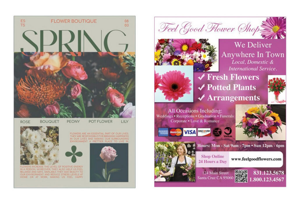
Now onto a layout example. Both of these flower shop graphics don’t follow a perfect grid layout, but only the one on the right feels overwhelming. The one on the left has a cohesive treatment to the photography, the type is uniform, we have a hierarchy of information, our eye feels like it can rest on certain areas, and the alignment and overlap of elements feels intentional. For these two flower shop brochures, 87.50% picked the one on the left.
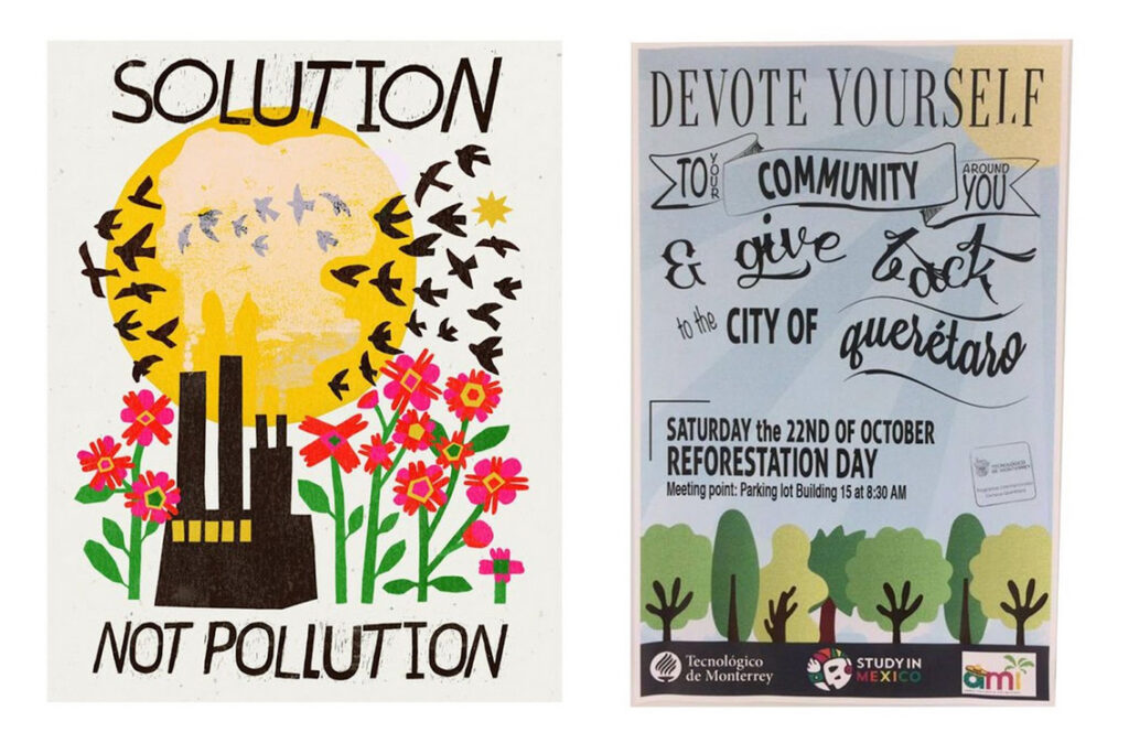
Here are two poster designs, both with environmental messaging and both using typography and illustration to deliver this message. However, the typography in the right example feels disjointed and unreadable at times versus the one on the left feels cohesive. 81.25% of non-designers preferred it to the one on the right.
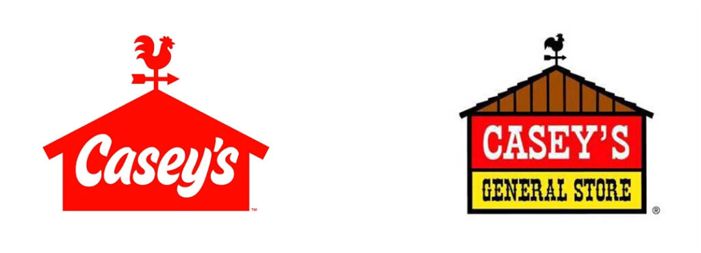
Here’s where my study grew interesting. As someone who grew up in the Midwest, Casey’s General Store is a staple. I am very nostalgic toward the logo on the right. It’s the logo I grew up with, and it brings back warm memories of delicious gas station pizza. However, as a designer, I think the logo on the left is amazing. It’s simple, it’s fresh, it calls back to the old logo with the barn shape and weathervane, and it retains its approachable quality through the handwritten font. It’s objectively better from a design standpoint.
The majority, at 56.25% agreed. The numbers here were tighter, which I attribute to that nostalgia factor because nearly all of the people I polled were from the Midwest. 31.25% said they preferred the older logo, and 12.5% said they preferred either one.

Let’s take another look at nostalgia. 100% of Gen X, who would have been more familiar with the Ebay logo on the left, voted for the left. However, the overwhelming majority, at 81.25%, voted for the logo on the right and from a design perspective, this would be the correct choice. The logo on the right moves away from the awkward overlap of semi-transparent typography to create a simple, contemporary logo that feels more trustworthy and professional overall.
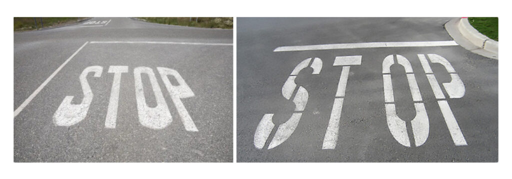
Of course, every survey needs a paradoxical response, which is where I introduce this comparison. If you are a designer, your initial reaction to the kerning exhibited on the right is probably to cry, scream, or throw up. I sincerely regret to inform you that 43.75% of people picked the one on the left, 43.75% picked the one on the right, and 12.50% said neither.
I had to do more investigating and after asking people who preferred the one on the right why they did, most said they were bothered by the distortion of the photo on the left. Perhaps they didn’t know what they were looking for. Perhaps they didn’t see that massive, astronomical, blatantly aggressive gap. Perhaps they would rather “ST OP” than “STOP.” I think I need to do another poll.
So, what did we learn from all of this? (Aside from the “stop” situation which we’re all pretending didn’t happen).
We learned that even if non-designers aren’t able to articulate why they gravitate toward one design over the other, they still recognize good design most of the time and this is usually because good design is pretty objective when it comes down to it.
For example, good design usually has visual appeal. People are naturally drawn to things they find to be aesthetically pleasing. This is why things like harmony, balance, color theory, and composition are all so important in graphic design.
Good design is functional. It communicates a message, whether that be storytelling, entertaining, educating, or selling. People appreciate being able to understand this message and have this message be accessible to them. This is why things like clear typography, intuitive layouts, and hierarchy of information are needed.
Good design reflects professionalism. Even if people don’t have a design background they can discern when something looks high-end, well-crafted, or polished. Professional design adheres to design principles and those things like white space, alignment, and attention to the smallest detail are standards in professional design.
Good design has the power to evoke an emotional response. People can sense when they resonate with something, regardless of their ability to understand why. This is why storytelling, color psychology, strong imagery, and thoughtful visual direction are so important.
Lastly, good design is purposeful. It understands its target audience and is aligned with the brand it represents. People gravitate towards things that are relatable to them and resonate with their tastes. This is why authentic branding and consistency within a brand are a must.
As a designer, I believe there is good design and bad design and most people see the difference. However it’s my job to know the difference, put it into practice, and fight for it, especially in the case of closing an offensive gap between two letters, nevermind that 43.75%.
Ready to do some nice design work? We can help!
Get insights delivered straight to your inbox.